It’s pretty much exactly what it sounds like. Lots of maps. And it’s mesmerizing. Not only are maps fun to look at, they also explain the world.
Here are some from more recent postings:
1) Countries and the number of cities they have that are larger than the capital

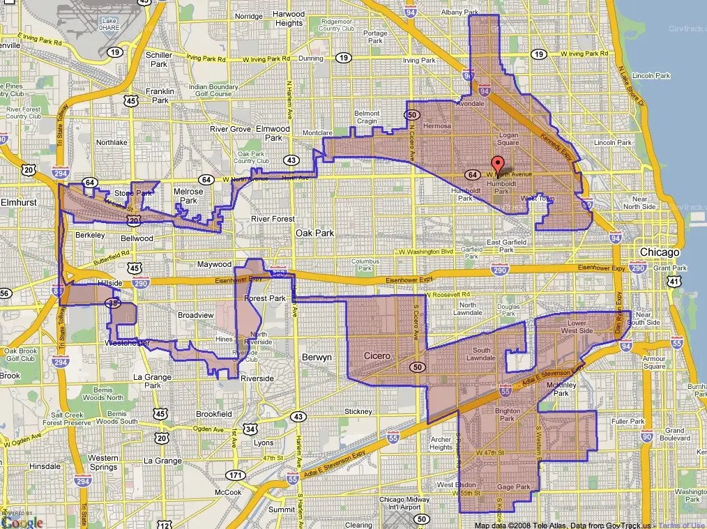
2) The Shape Of Illinois’ 4th Congressional District
3) States’ country doppelgangers, by area

4) States’ country doppelgangers by population

5) Counties with more people than all of Wyoming

6) Weird Slovenia-Croatia border that goes through a restaurant.

7) Tiger habitats, 1850 (yellow) versus 2006 (green)

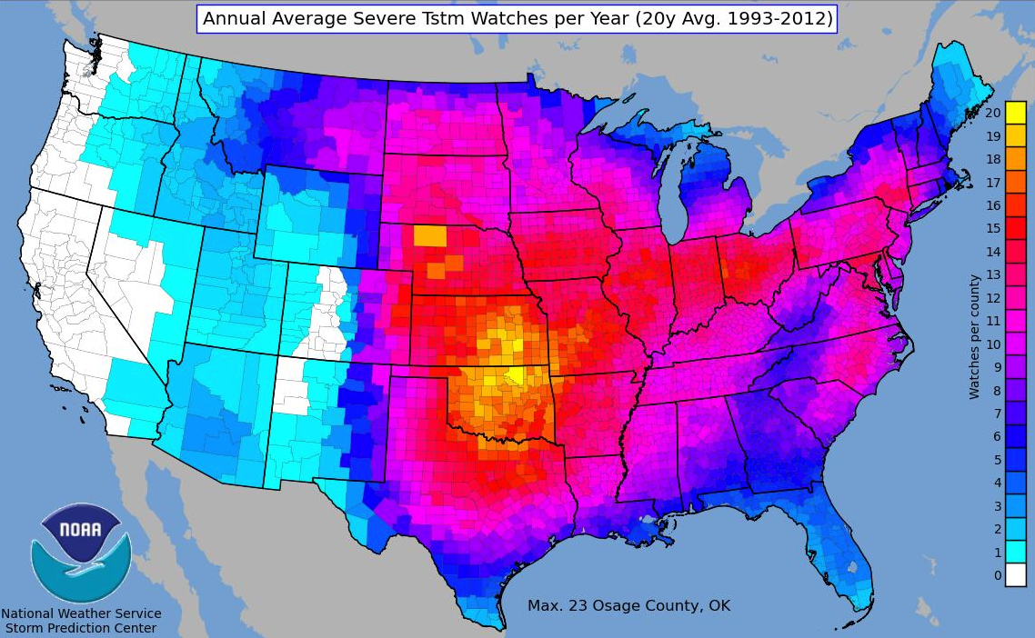
8) Counties with most thunderstorms watches
9) Counties with most tornado watches

10) Tornado probabilities, 1982 – 2011

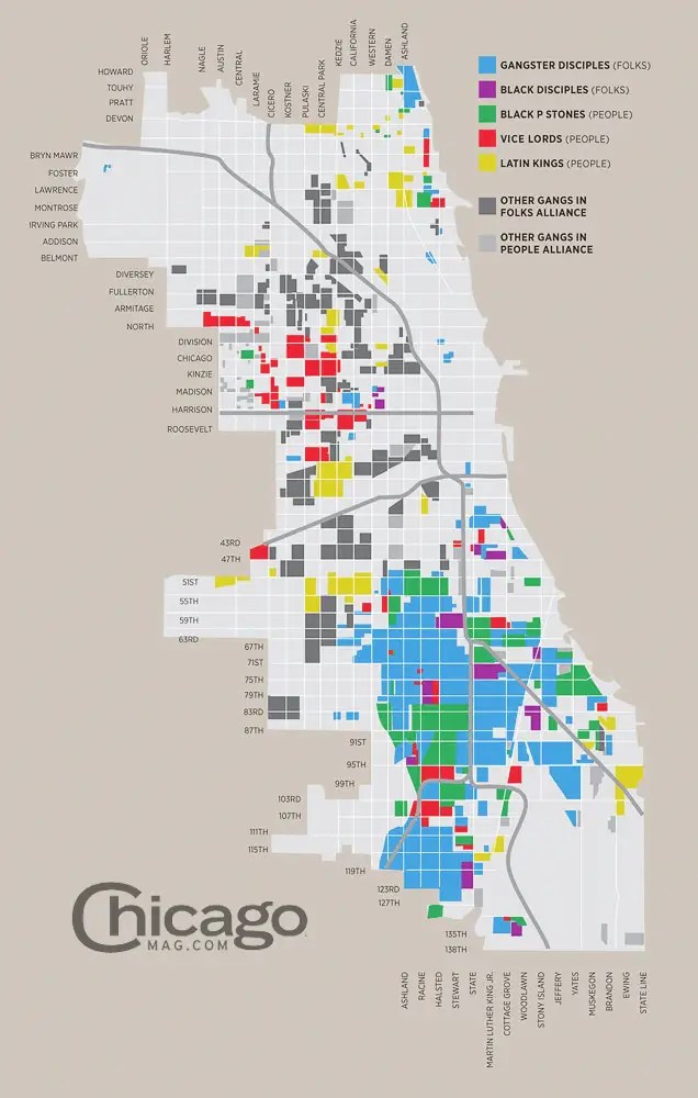
11) Chicago’s gang territories
12) Austin’s city limits

13) The most famous brand states have produced
.jpg)

This is very attention-grabbing, You are an overly professional blogger. I’ve joined your rss feed and look ahead to seeking extra of your great post. Also, I’ve shared your site in my social networks
My brother suggested I might like this web site. He was totally right.
This post truly made my day. You cann’t imagine simply how much time I
had spent for this information! Thanks!